SeekMed
SeekMed is an open aggregator of doctors of various specialties. The project is implemented in India and is very popular. With SeekMed, the user only needs to find the right doctor and book a traditional or online appointment.
It is worth noting that this useful product had two big disadvantages – a completely uncompetitive design and a low conversion rate. We sensed these problems and suggested that the company has a full redesign of the service and develops a stronger brand identity for the SeekMed line.
- March, 2017
- Google Play
Task
A visual presentation of the new logo, as well as the actual rationale for the rebranding for the SeekMed app.
Solution
When working on the new version of the logo, we tried to take into account the identity of the company’s existing product – the mobile app. We created the logo so that it would fit perfectly into the application without any additional modifications. At the same time, the new stylistics became a source of inspiration for the designers when working on the updated version of the website. After all, the site is just as important brand carrier as a business card.

Logo
The logotype is the most important component of the visual presentation of any company. The logo will be strongly associated with your company, its services and positioning by customers. It will become a sort of trigger in people’s mind, that will get the right association with the brand at the right moment.
Visual metaphors
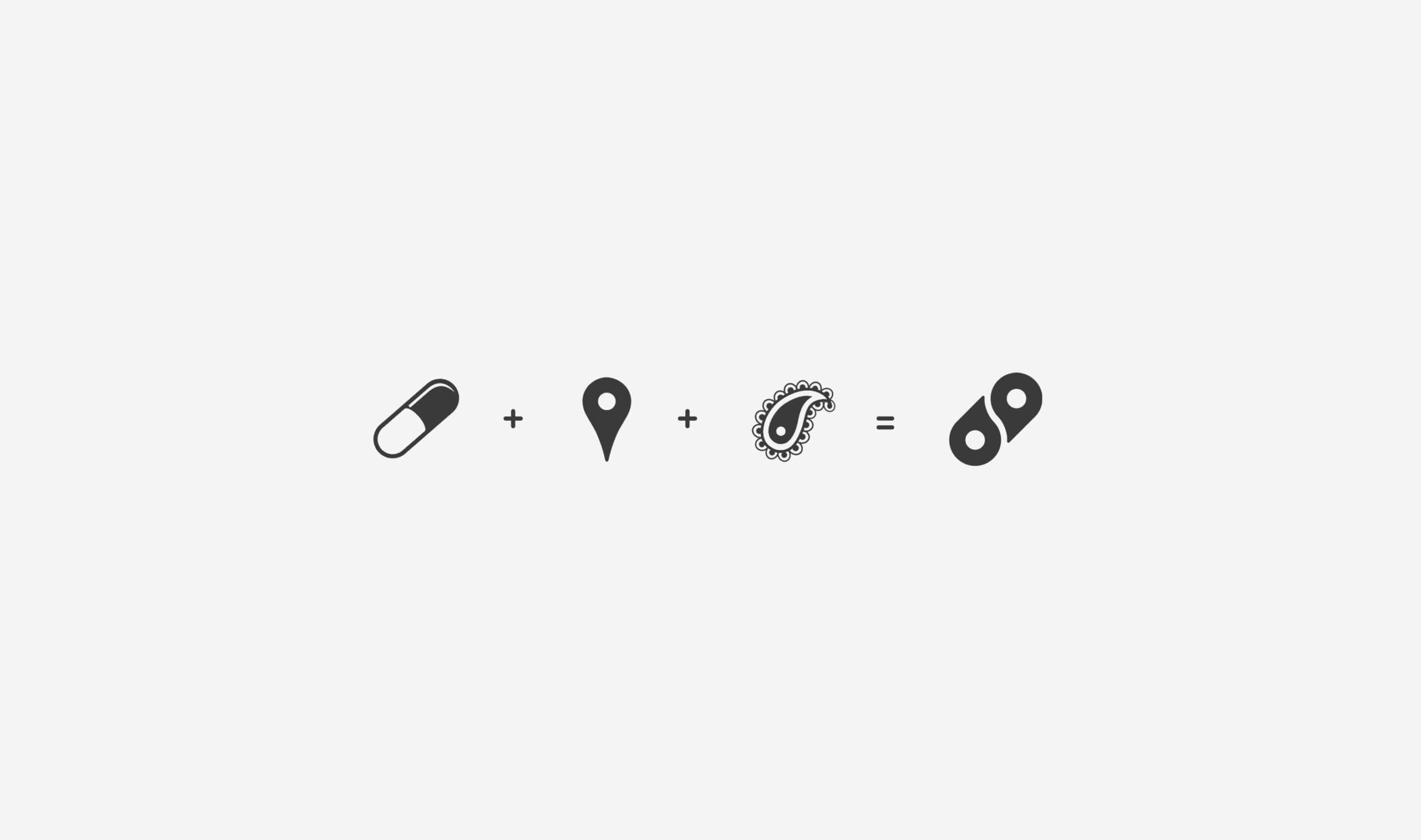
As a main metaphor, we have chosen the form of pills, as a reference to the medical roots of the project. It is formed by the visual approach of two geo-markers. Geo-markers themselves are an additional metaphor that points to the business model. Also, there is a third metaphor, less obvious, working on the intuitive level. These markers have a visual similarity with elements of traditional Indian ornament.
Colors and fonts
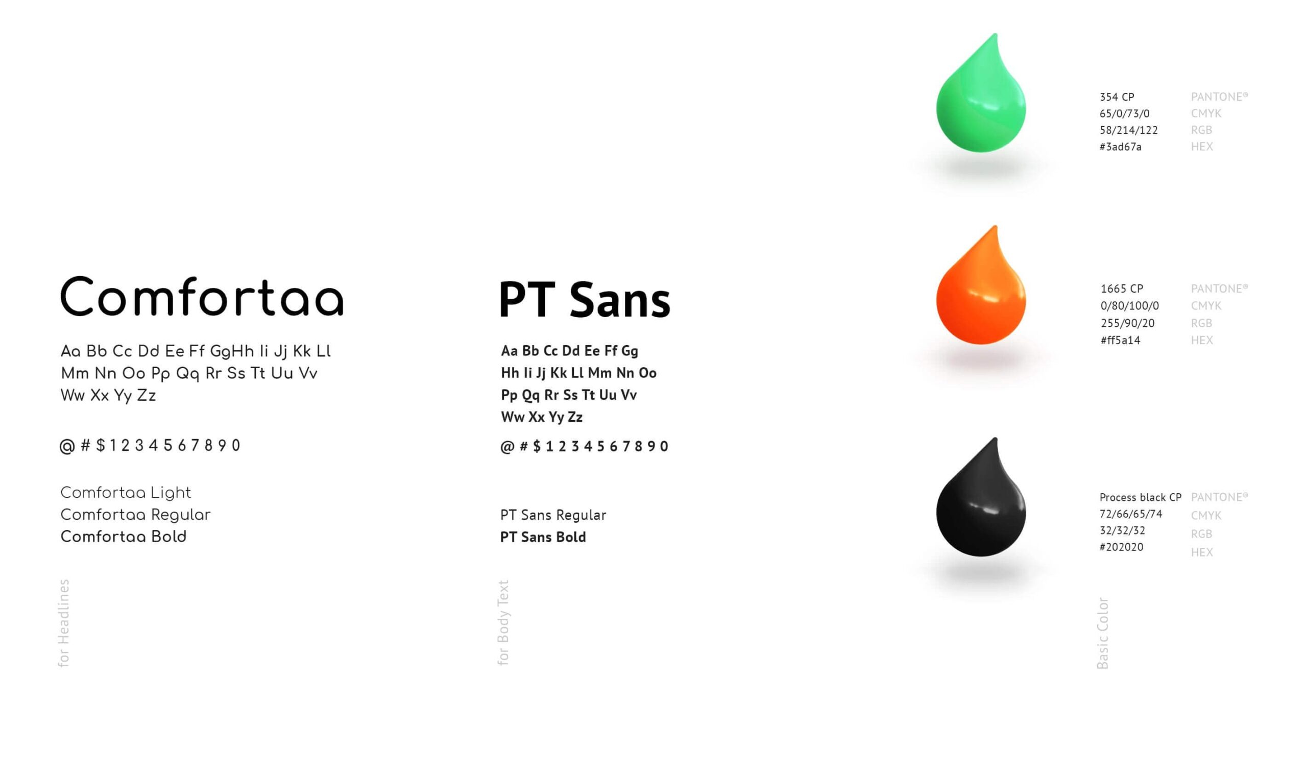
The SeekMed brand identity uses two main fonts.
Comfortaa is used in headlines, slogans and names. The rounded and harmonious forms of this font perfectly emphasize the logo and corporate identity as a whole. All fonts are acceptable, but Bold is recommended.
PT Sans is an additional font and serves mainly in the typing of large text blocks. This font has excellent readability.
The SeekMed brand identity uses two main fonts.
Both fonts belong to the free font group of Google Fonts and have a free license.
Color coding
Colors are an important part of the brand and allow it to be better identified in the marketplace.
The brand colors are orange, green and dark grey (black when printed). The color version of the logo is usually placed on a white background.

Logo structure
For easy scaling of the logo, we took as “X” the diameter of the geo-marker measurement of the graphic part of the logo. The internal dimensions of the logo are also tied to the unit “X”. They are needed for ease of manufacturing and mounting the logo in the physical version, as well as for understanding the construction of the logo grid.
When using the logo at different points of contact, we used a “guard field” because it avoids conflict between the logo and other graphic elements.
App icon
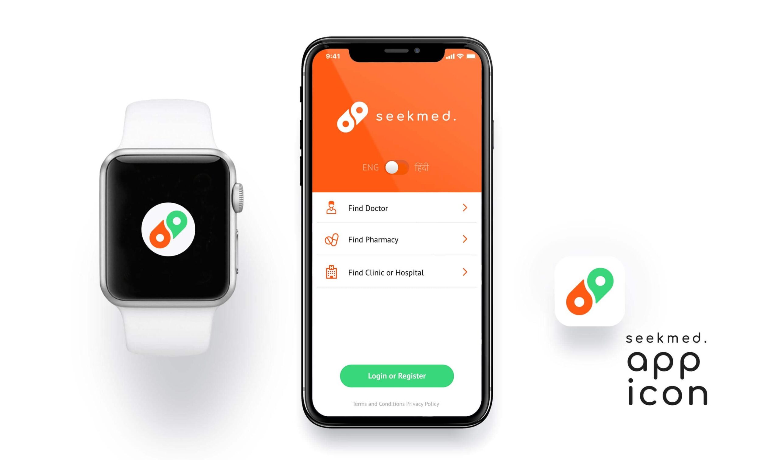
You can see how the SeekMed icon compares favorably to competitors’ apps and products. We managed to get away from such frequently used images of the medical sphere as a cross and the traditional sign – the Rod of Asclepius and to distinguish the application competently from the huge number of similar ones.
Unified design
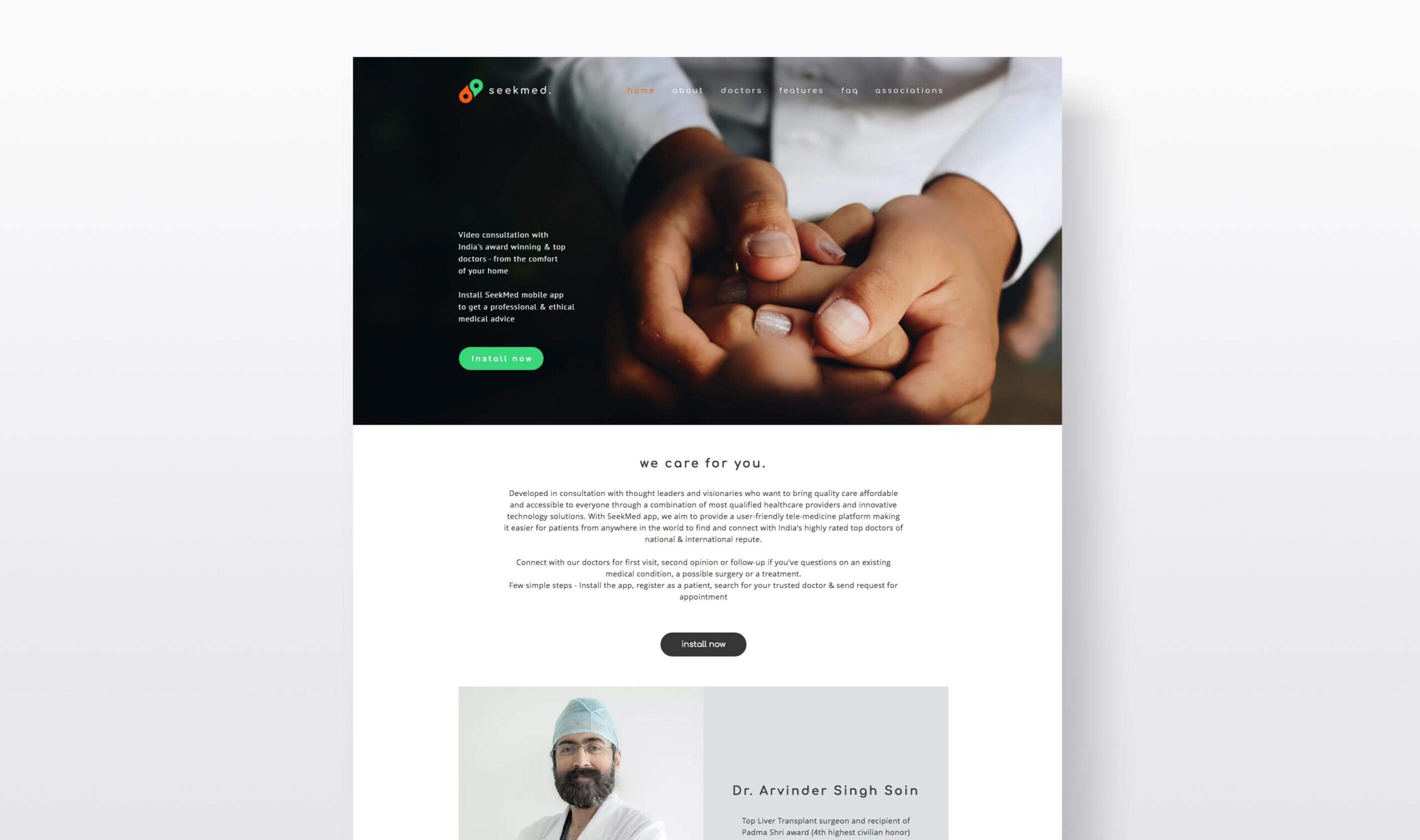
The quality work is inspiring. The design developed for the app served as a great opportunity to update the website. This is just the case when the visuals easily transitioned into another product. A unified design gave the website its personal brand identity. Also, the interface itself, along with the logo, looked more cohesive and complete.

Marketing items
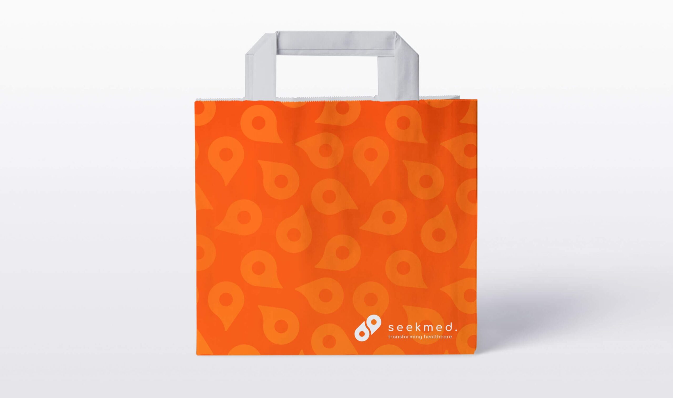
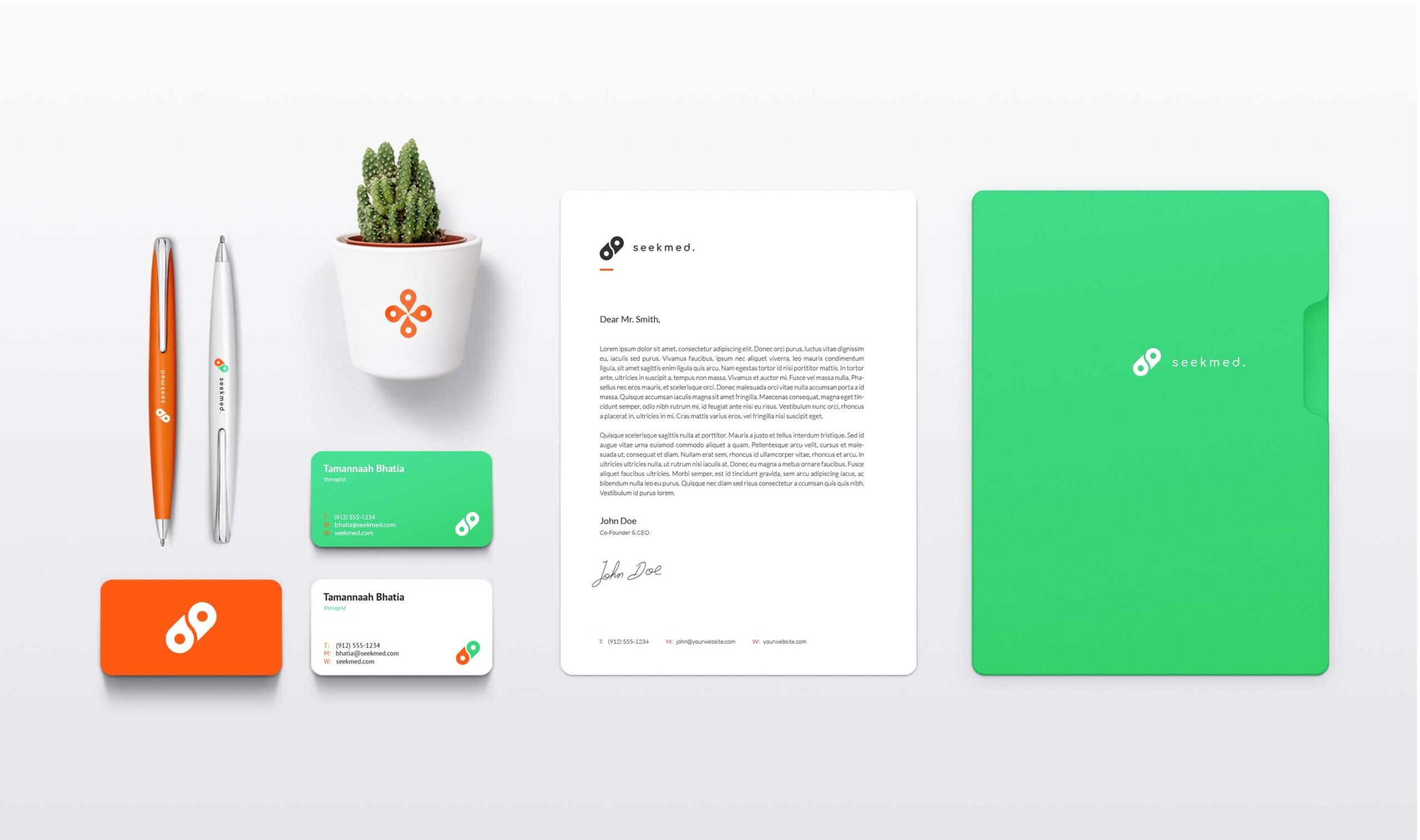
The new logo works perfectly on various types of physical media: business cards, document folders, stationery. The story of SeekMed brand development shows that the secret of branding success lies in the unity and integrity of style.
